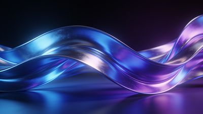
A single splash of the wrong color can spike heart rate and break concentration. Swap it for a cool, balanced blue background and the difference is immediate: lower visual noise, steadier breathing, and fewer "where was I?" moments.
Why blue helps the brain lock in
Scientists track heart variability and eye-movement speed while subjects solve puzzles. Results stay consistent: mid-tone blues reduce physiological arousal compared with warm reds or high-saturation neons. The color reads as distant sky or calm water, reminding the brain to relax but stay alert. A wallpaper that leans into those wavelengths gives you that edge every time you glance at your second monitor to check a notification.
Still, not every blue works. Electric cyan flickers on OLED panels, and dark navy can hide desktop icons in shadows. The selects below ride the sweet spot-roughly between RGB 80/140/200 and 40/80/130-where text contrast remains ideal and the scene feels spacious rather than gloomy.
What makes a wallpaper genuinely calming
The hue is only half the recipe. Scan any candidate for these three traits before you set it as your daily driver:
- Low visual density: Few sharp lines or tiny repeating shapes. Your peripheral vision should see flat zones, not busy texture.
- Stable luminance: No harsh spikes from almost-white to almost-black inside a single quadrant. Gradual gradients keep the optic nerve from rapid constriction.
- Center of interest below icon grid: On desktop, the hero shape should sit 30-40 % from the bottom so it never collides with the top-left file stash.
Quick tip: browsing the Calming category already filters out most hectic compositions, saving manual scrutiny.
Five blue styles worth trying this semester
Each entry meets the criteria above and has stood up to weeks of real-world use on both ultrawide monitors and 6.5-inch phones.
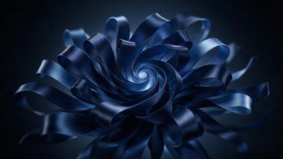
1. Soft gradient mesh Think macOS Big Sur minus the magenta. Flat at the edges, a gentle cyan-to-azure blend in the midpoint. Works well with translucent taskbars because there is no single high-contrast seam. 2. Minimal shoreline photograph Slow shutter, early dawn. A narrow strip of sand at the bottom grounds the image; the rest is glassy water tilting toward the horizon. Icon readability stays perfect thanks to the natural vignette. 3. Abstract ribbon bloom Windows 11 fans already know the look. A satin ribbon curls in soft focus, highlights topping out at 60 % brightness. Grab the Windows 11 Dark Blue Bloom 4K HD Wallpaper if you want the official flavor without the stock logo. 4. Particle nebula Thousands of micro-dots drift from the lower right, density fading toward the cursor area. The motionless particles suggest depth without actually moving-ideal for focus mode. 5. Monochrome mountain silhouette Fog hides detail, leaving two or three calm ridgelines against a pale sky. The negative space above the peaks gives maximized breathing room for a tab-heavy browser window.
Filter the Blue category, then combine the sidebar resolution filter with your display’s native pixels. Most of the options load at 4 K or higher, so there is headroom for parallax crops on iOS 17.
Applying on Windows 11 and macOS Ventura
A proper file is only the first step. Operating system scaling and accent colors can undo the calming effect if they clash.
Windows 11
- Download the image in its original resolution. Avoid “fit to screen” previews that compress to 1080 p.
- Right-click the desktop, choose Personalize -> Background.
- Set Personalize your background to Picture and Choose a fit to Fill. Stretch, center, or span introduces jagged edges on ultrawides.
- Switch Accent color to Automatic so the taskbar matches the dominant hue.
macOS Ventura and newer
- Open System Settings -> Wallpaper.
- Add the file with + -> Add Photo.
- Pick Still instead of Dynamic to avoid tone shifts at sunset that pull the palette toward purple.
- Disable Show Wallpaper Tinting in Windows for transparent menu bars that keep the blue unmuted.
Keeping the workspace fresh without breaking focus
Blue works because it fades into the mental background, but the brain still enjoys small novelty cues. Rotate between two or three hues in the same family each week so the scene feels intentional rather than invisible.
- Schedule a weekly automation on Windows Task Scheduler or macOS Shortcuts that replaces the wallpaper at 7 a.m. Monday.
- Build a local folder called \Focus_Blues and drop new finds there. Tag them with color values in file names so you remember why you saved them.
- Star your favorites on the site so they resurface under My Collection after a clean install.
If you ever need a quick reset after an all-night cram session, that folder plus the cloud queue of starred picks lets you restore the entire calm atmosphere in under a minute.
The bottom line
Color psychology is not hype. Mid-tone blues lower arousal, flat gradients prevent eye strain, and tidy subject placement keeps your desktop icons legible. Spend five minutes assembling a micro-rotation of calming blue wallpapers today and buy yourself hours of steadier focus for the rest of the semester.