The mid-year download report surfaced an unmistakable pattern: a handful of usernames keep showing up wherever the Top 50 lives. Dig into the file stats and a story emerges-new color palettes, smarter aspect-ratio thinking, and a willingness to chat with commenters. This spotlight unpacks who these creators are, why their work converts casual browsers into daily downloaders, and what you can borrow for your own uploads.
What the 2026 download charts reveal
When January numbers rolled in, abstract gradients still ruled. By May, cyber-metropolitan scenes and soft-glow geometry had jumped ahead. Three data points stand out:
- Portrait orientation is up 28 % compared with the same period last year. Foldable phone owners crave tall files.
- File size ceiling moved to 7 MB. Users stopped flinching at heavier PNGs once they saw cleaner color transitions.
- Creator follows grew 42 % after the comments revamp launched in February, proving that a bit of back-and-forth boosts loyalty.
The shift lines up with the rise of five names you will keep running into on the Digital Art feed. Each rides a different niche yet shares a relentless focus on device feel rather than just gallery looks.
Five creators rewriting the wallpaper playbook
- NyxVoid - Specializes in midnight neon corridors that sit one stop above pure black, giving OLED panels depth without the power drain. Signature piece: Night Channel 7 hit 350 K downloads in twelve weeks.
- AureliaFrame - Fuses Art Nouveau curves with volumetric lighting. Her files land in both ultrawide and phone-safe crops on day one, eliminating the usual “desktop only” complaints.
- ByteForge - Known for circuit-board cityscapes. He embeds subtle parallax clues so Android’s motion wallpaper toggle feels purposeful, not gimmicky. Check the colour-matched variant in Quartz Matrix.
- Skylume - Runs AI-assisted sky renders through a hand-painted pass, avoiding tell-tale diffusion blur. Her pastel sunrise set pushed the Futuristic category to a new traffic record during March.
- KuroLens - Shoots macro photographs of crystal shards, then layers vector halos. Viewers think “3D render” until they zoom. His Prism Breach series spiked after a community Q&A where he posted raw EXIF data.
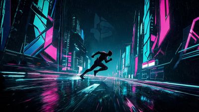
Example wallpaper: Neon Runner In Cyberpunk City 4K HD Wallpaper - Neon Runner In Cyberpunk City 4K HD Wallpaper shows NyxVoid’s color discipline: blacks sit at #050505, preventing banding while still saving battery on AMOLED.
How these artists craft files that feel alive on your screen
Spend five minutes inside any of their project files and you notice repeatable habits:
- Resolution first. They start with a 4 x base resolution canvas-typically 7680 x 4320-then downscale with Lanczos resampling to 3840 x 2160 for desktop and 3200 x 1440 for phones. Sharpening comes after scaling, never before.
- Color-profile discipline. Every export stays in sRGB. Wide-gamut looks great in Photoshop, but phones without Display-P3 support shift hues toward green.
- Noise pass to fight banding. A 1 % monochromatic noise layer hides gradient steps that JPEG compression would exaggerate.
- Dual-crop testing. They preview the lock-screen clock on iOS 17 and the pull-down shade on Android 14. Any element conflicted by both gets nudged.
- Comment loop. Finished isn’t final. ByteForge silently updates version numbers in the file name, letting collectors redownload without losing the earlier iteration.
These details explain why their work feels plug-and-play regardless of device. One glance at download comments reveals fewer “how do I make it fit?” questions compared with average uploads.
Follow their lead: tips for collectors and aspiring uploaders
For collectors:
- Hover over the follow button when a creator drops two files you keep. Algorithmic surfaces learn fast, but direct follows guarantee you see the next post.
- Use Favorites liberally. It doubles as a changelog; when AureliaFrame updates a PNG to fix color banding, your library highlights the revision.
- Rotate styles weekly. Pair a dark neon scene for night with a soft dawn gradient for mornings to avoid screen fatigue.
For creators eyeing the 2027 list:
- Prototype at phone scale. If it looks muddy at 1440 x 3200, no sharpening filter will rescue the desktop version.
- Metadata counts. Tag both the mood and the technique-“vector,” “long-exposure,” “AI mix.” Search surfaces rely on that specificity.
- Engage in the first hour. The comment algorithm boosts posts with creator replies before the 60-minute mark.
- Offer alternate crops. A square 1:1 variant keeps tablet users from awkward letterboxing.
Finally, remember that each spotlighted artist reached the chart by shipping many experiments, not by chasing a single viral hit. Steady iteration, visible listening, and export hygiene still outrank luck.